Recently we asked some associates to discuss packaging design innovation and trends. The informal roundtable discussion reminded us of microinteractions, a concept rooted in web and app design.
Nottingham Spirk
As Dan Saffer writes in his e-book Microinteractions: Designing with Details, the difference between a good product and a great one are its details: the microinteractions that make up the small moments inside and around features. How do you turn mute on? How do you know you have a new email message? How can you change a setting? All these little moments — which are typically not on any feature list and often ignored — can change a product from one that is tolerated to one that’s beloved.
Packaging is important in much the same way. The consumer’s interaction with it may be fleeting, but it can play an important role in the journey, from the decision to purchase to deciding whether to re-purchase. To illustrate this, we’ve pulled some highlights from our associates’ hour-long chat. Participating were Carolyn McNeeley, Design Project Manager; Stacey Sullivan, Senior Consumer Insights Manager; and Lindsey Tufts Jr., Product Design Specialist.
Isn’t packaging just functional?
SS: You’ve got two different things that make packaging so important. The first is making the first impression. A lot of products don’t get advertised, so having a package that can quickly tell the story of what the product is critical. The second is that it protects the product. And so, it’s important not only from a design aesthetic but also from a functionality aesthetic as well.
LT: That point-of-purchase, two-second presentation is extremely competitive. You’ve got two seconds to really hit the consumer and make them respond to your product. How to do that is always changing, and it really comes down to the graphics. Is your package graphically designed in such a way that you can grab the consumer’s attention?
PN: If it's tactile in some way, whether through materials or functionality, it makes the customer want to pick it up. Once a package is in their hands, they're more likely to buy it. The "try me" package is a great example of that.
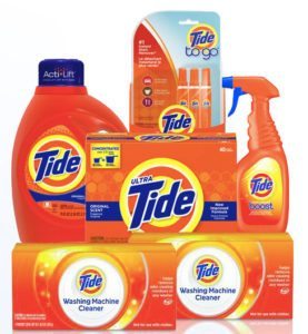
SS: Tide laundry detergent — everybody knows that logo. It doesn’t matter if you buy the liquid, the pods or the powder, it always says Tide to you. It’s got a good enough logo and brand recognition that it’s entrenched and feels higher end, even though it’s something you’re going to use and throw out. Procter & Gamble does a good job of marketing their brands so that you feel like you’re getting something a little more valuable than the generic.
What role does packaging play in brand experience?
CN: A good package should feel like a reward for making a good purchase. This is a good example [a flat iron in a sturdy cardboard box with high-quality photos and a magnetic closure]. The idea is to present the product to the consumer, much like Apple does, like it’s a gift. Packaging can have other elements too, even for consumables, like this Werther’s candy box. There’s an audible click when you shut it. It gives a secure feeling, it’s a nice finish to putting it away. It’s just corrugate, but it’s designed in a way that it gives you that finish.
SS: It seems that one of the innovations happening more in packaging is how the package is opened and closed. This Tampax box and the Werther’s box both have unique opening and closing, not just the traditional cereal-box closure where you have the one tab. Even Nerds candy has a unique way to slide the package open so you can pour a little bit out and close it, and you know it’s sealed. If you look at 5 Gum, it’s designed so that you can flip it open with one hand. That’s a very low-cost innovation. To me as a designer, those are beautiful things. It’s like a free feature for the consumer.
CN: The Tampax box is perforated at an angle so it’s a one-touch closure.
PN: And the wave shape reinforces the branding.
LT: I remember getting a watch that came in a box, but inside was an aluminum tube that had the watch inside of it. I didn’t expect that, and it increased my liking for that brand. It was really cool. I like the boutique effect, and I see that more in high-end products like wine, jewelry, perfumes, things like that. It’s an emotional connection. The manufacturer wants someone to buy the product, and then buy it again, and then tell other people to buy it. So if the consumer can’t make that emotional connection with your product because the packaging is poorly designed or frustrating, that’s a problem.
What inspires innovation in packaging?
PN: I keep noticing that more food products come in a pouch now — kids’ food, yogurt, and other food products that used to come in rigid containers. I’ve seen sour cream in a squeezable pouch, adding functionality.
CN: That’s an interesting point. When I’m designing, I look at the whole gamut of packaging in mass production. I look at what’s trending in food packaging, what’s trending in shampoos and beauty care, and we pull examples from all over. Something that works for cheese, for example, a zip-top bag, we might try to see if we can make that work for a razor. It’s important to cross categories.
 LT: I look everywhere for inspiration. I look at nature. I look at light. Texture, fabrics, the fashion industry, automotive. What are the new, fun things that people connect with emotionally? And can I pull some of that feeling into a package design?
SS: We recently had a challenging Christmas tree packaging project.
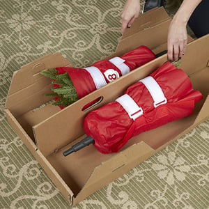
PN: Yes, the Ultima Tree. It’s a Christmas tree with ten sections, and the client wanted it to ship in individual boxes within an outer box, so that the customer could reuse the boxes for storage. And all the smaller boxes had to fit in the existing cube. That ended up being impossible, so the team designed reusable fabric wraps with Velcro closures that protect the branches.
What role does packaging play in pricing?
CN: At the end of the day packaging has to be cost-effective. We want it to protect the product, present the product and provide an enjoyable experience, but it has to be cost-effective. So, we do a lot of working backwards. Sometimes we have a retail price in mind, and we work back into that, and we end up with, “OK, this is how much you can spend on packaging.” But you still have to try to be innovative.
SS: And you have to test it, separate from testing the product. We had two recent cases that showed the importance of testing the packaging. In one, if we didn’t, we would have made a mistake on the shelf. The scene that client wanted made people think the product was for use outside the home, and it wasn’t. The package didn’t communicate what it needed to communicate. In the other case, we showed people the packaging and as soon as they saw it there was excitement, there was delight, and people got what the product was, even though it’s completely new in the market. So now there’s real potential that that product will do well.
CN: I don’t know if this is a trend or not, but I’ve noticed that some products that used to be packaged aren’t anymore. I’m thinking of home décor and holiday decorations. A lot of it is not boxed, it’s tagged. I’m sure that has retail challenges, but what more do you need to know if you can actually see it and touch it and turn it on. It would be interesting to go back in time and see how much we’ve unboxed.
LT: I had a teacher in Japan who always said, “Simple is better.” There’s always the temptation to complicate things, but people won’t gravitate to your product if it’s not easy to understand, easy to open, easy to assemble. And the easier it is to use, the easier it is for me to make the decision to buy that product again.
Packaging is changing
“Mobile has forever changed what we expect of brands,” writes Google. “It’s fractured the consumer journey into hundreds of real-time, intent-driven micro-moments. Each is a critical opportunity for brands to shape our decisions and preferences.”
Google’s advice pertains to the digital realm, but we contend that it applies to the real world as well. Packaging should not be the last stage of innovation, an afterthought to what it contains. Increasingly cluttered markets and the rapidly changing nature of consumer-brand interaction demand parallel development of packaging with greater attention to aesthetics and functionality.
About Nottingham Spirk
Nottingham Spirk is a business innovation and product design firm with an unrivaled record of delivering disruptive consumer goods, medical devices, and packaging design solutions to market. We collaborate with Fortune 1,000 companies, funded start-ups and non-profit organizations to discover, design and execute product programs and strategic business platforms that will delight customers, grow markets and generate new revenue streams. Learn more about our innovation approach.
Submit a comment